Roofing
Robinson
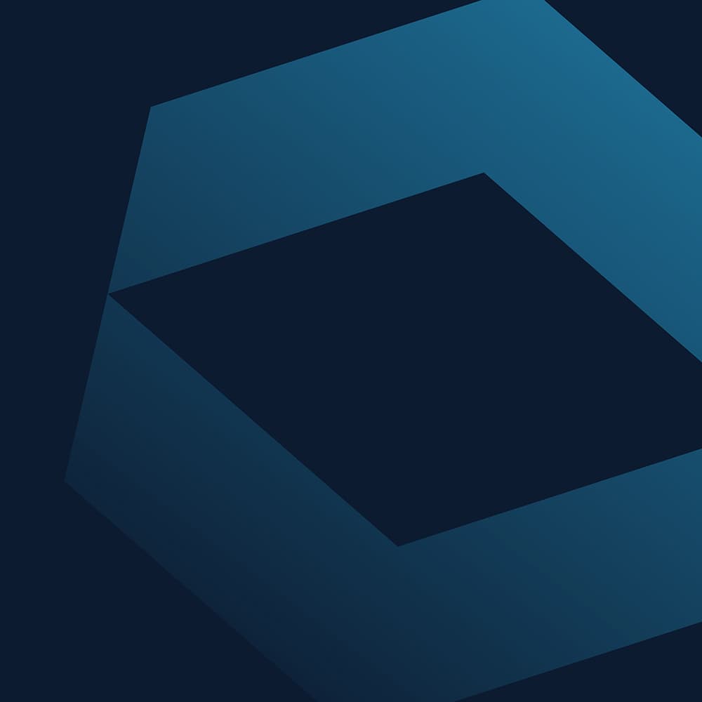
The REX Agency contracted me to rebrand Robinson Roof Solutions to enhance its national identity. The logo icon’s negative space symbolizes the roof, and the blue chevrons reflect the action and urgency required. Black-and-white photography provides a timeless aesthetic, reflecting the company’s 16 years in the industry. The corporate blue colour instils a sense of familiarity and confidence. The digital palette utilizes a colour visual language for each unique call-to-action. The icon gradient watermark provides a fresh and modern touch that inspires trust and confidence.


"A successful roofing company outgrew its start-up brand. With plans to niche and grow, it was a time for a new rebrand (and strategy)."


The final brand identity was successful, resulting from a strategic process that involved key company stakeholders. They needed guidance and expert advice to choose an identity aligned with their customer demographic rather than their personal tastes or egos.